Travesty
Logos hold a lot of power in that they can influence how consumers feel about an organization or product as well as how the members within that organization feel about what they are doing. With that being said, it’s not uncommon for an organization to revamp their logo in order to reflect internal changes within their workings or as a means of renewing consumer interest in their products or services.
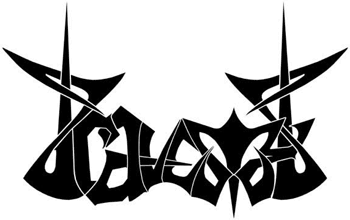
After some significant lineup changes and a slight adjustment in their musical direction, Travesty, a heavy metal band based out of Queens, New York, was ready to be reborn and reintroduced to their target audience as a changed band. While their new logo was created to signify to the audience that the band had started a new chapter in their lives, it also served as a therapeutic means for the members to separate themselves from their previous musical incarnations. In essence, the band was assuming a brand new “face” that was all their own. I have since been told by the band that their new logo and new website (which I also created) helped reinvigorate the members in terms of how they approached performing.
When I’m working with a client, it’s very important to me that they are satisfied with their completed logo. Maybe I’m a bit cynical, but it seems like people are becoming more and more complacent to willingly accept lackluster products. That may or may not be the case (though I’m quite sure it is), but that doesn’t mean that I have to be satisfied with turning out a product that is below my own standards.
My approach is fairly simple in this respect: it’s not done until it’s done right. Since part of a logo truly being “done” is the client’s satisfaction with it, there is always a bit of tweaking that needs to happen to get it just right, but I really don’t allow my clients to see designs prior to the tweaking phase until I’m satisfied with them. Quite simply, if I don’t think I can stand by it, then I don’t release it because a bad logo reflects poorly on both your operation and mine.
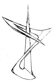 |
Initially, the boys in Travesty only wanted a new “T” logo, but after I completed it, I noticed the makings of the letter “r” in the lower right portion of the graphic. I couldn’t resist and I just had to finish the name. I talked to them about it and they enthusiastically said “go for it.” |
|
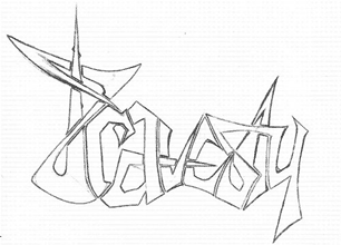
On my first pass through, I got the majority of the logo down, but I thought the second “t” in “Travesty” seemed a bit illegible and I felt the “y” seemed a bit too cartoony in comparison to the rest of the letters. I rescanned the logo into the computer, erased the areas I was unhappy with in Photoshop, and then reprinted the design. |
 |
|
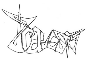 |
On my second pass, I was successful in fleshing out the second “t”, but the “y” now seemed a bit too ornate and thin in comparison to the rest of the logo. |
|
I really liked the symmetry of the new second “t”, so I decided to play with the graphic in Photoshop. I designed the final version of the “y” to both adhere to and disturb the symmetry that the second “t” had. After this however, between the difference in size of the main “T” and the “y” in “Travesty” and the first half of the logo being asymmetrical and the second half of the logo being fairly symmetrical, everything seemed to be a bit imbalanced. |
 |
|
 |
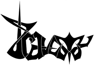
In an attempt to remedy this, I originally took the first “T” and flipped it horizontally. Then I modified it slightly so that it would intertwine with the “y”. I liked the effect it gave the logo – it reminded me of the Jacob’s ladders that you see in the labs of mad scientists. |
|
While I liked the “Jacob’s ladder” version of the logo, it hadn't escaped me that I did basically add an extra “t” to the end of “Travesty”. Call me crazy, but I don’t think most organizations appreciate it when the graphic design guy changes the spelling of their name. So to solve this problem, I transformed the second “t” into a spike. This served to balance the logo, maintain the Jacob’s ladder effect, and also kept me from having to break the news to the boys about the new name of their band. |
 |
|
|
||