|
|||||
 |
 |
 |
|||
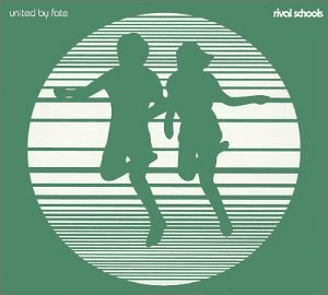
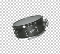
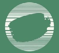
| Using the album as a template, I removed the joggers from the picture and recreated the original lines. | Since the joggers were going to be replaced by a drum (by nature, a fairly symmetrical object), I made sure to use a picture that lacked symmetry so it would show clearly as a silhouette. The angle and the snare clutch (the little handle on the side of the drum) is key to making the silhoutte clear.
|
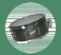
Next, the snare drum was layered over the background. | |||
 |
 |
 |
|||
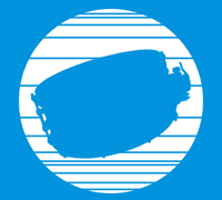
| After being placed above the background, the drum was masked with only one color. I found that the original lines in the background were colliding with parts of the drum that were key to making it identifiable. | To remedy the line problem, I removed some of them around key areas such as the aforementioned snare clutch. Unfortunately, doing so killed much of the depth and appeal of the original design. I also converted the color of the image to cyan, something I had always intended to do - keeping with my idea of integrating unorthodox colors and making them work.
|
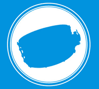
Being disatisfied with the "finished" project, I decided to scrap the lines and try some pinstriping instead. I'm a big fan of simple pinstripes as they can really make a plain object (a circle, in this case) stand out and come to life.. | |||
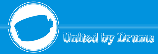
Being happy with my pinstripe experiment, I extended them out further to include the name of the messageboard. This western, saloon-style font was more or less a happy accident. Once again, it was an exercise in taking something out of the ordinary and making it work for my own purposes.
|
|||||
After having so much good luck with the pinstripes and the font, I felt like I was beginning to press my luck. Despite this, something seemed to be missing. Looking at the logo, I noticed that the pinstripes made the logo look very similar to an overhead picture of a drum. With this in mind, I added half-circles around the edge of the logo, giving it look of a drum with die-cast hoops.
|
|||||
